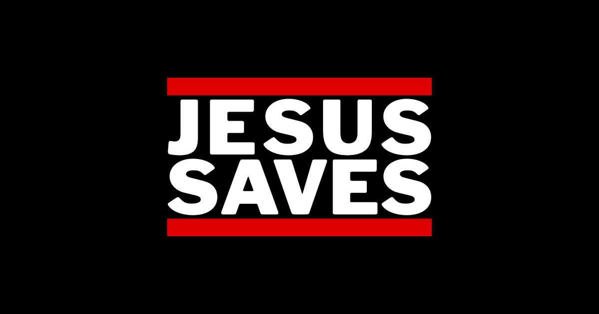
Inspired by the iconic Run DMC logo, this design boldly declares the simple yet powerful truth that Jesus saves.
I really wanted to stay true to the original design and use Franklin Gothic Heavy, but the variance in width between some letters made for an unbalanced look.
I ended up using Liberation which was close and monospaced. I thickened it up to make it “heavy” to complete the look.
Loading…

